Email marketing is an ever-evolving form of marketing. From plain text emails to HTML emails to emails with more advanced interactive and dynamic elements, emails have come a long way. At present, email template designs are becoming responsive and can be viewed on a screen of any size, especially mobile phones. Here is all that you need to know about mobile-responsive email templates.
What is a responsive email template?
A responsive email template can smoothly render and function properly across all devices. The responsive emails will work seamlessly across phones, tablets, and desktops. A generic email, designed only for desktops, will be disoriented and garbled when opened on a mobile phone. But, this problem is easily solvable with a responsive email template.
Unlike regular email templates, responsive emails are created by setting up two layers of CSS codes. The first layer is entirely dedicated to the desktop version. The second layer optimizes the template for mobile devices and tablets. The emails will render with the same clarity on mobile phones as on desktops.
Some brands are even taking the mobile-first approach. In this, the email template is designed especially for mobile phone users. One of the advantages of using mobile-friendly code is that it can be created with less coding compared to desktop display emails.
The only drawback of a mobile-responsive email template was that it was not supported by Gmail. However, the problem was rectified with an update in 2016.
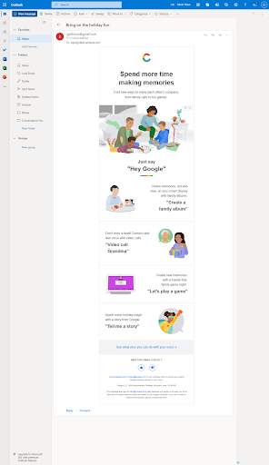
This email template by Google shows how mobile-first responsive email templates are being opened on desktop ESPs.
What are some of the changes that take place in responsive emails?
Usually, a desktop displays the mail in a wide-horizontal layout. The width of the email can be anywhere between 600 to more than 800 pixels. When such emails are opened on tablets and phones, the user has to zoom the screen and continuously scroll up, down, left, and right to read the email. A responsive email bridges the gap between these two screen orientations.
In responsive emails, the template is resized to fit on mobile screens. Since it is an adaptive design, the template transforms from a multi-column design to a single vertical column design. The various elements are stacked on top of each other for easier accessibility. The text size increases, and the image size decreases. The CTA buttons are also resized to be more visible. In addition, the CTA buttons are also made easily clickable with a thumb.
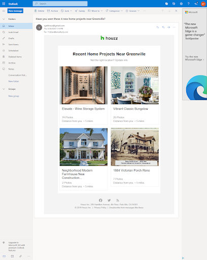
The recommendation email sent by Houzz has two columns when viewed in Outlook on desktop. But, when opened on a mobile phone, the elements are stacked on top of each other.
Why create mobile-responsive email templates?
The number of emails opened on mobile phones is growing with each passing year as compared to emails opened on desktops. An estimated 2/3rd of all emails are viewed on smartphones. If your emails are not mobile-responsive, 70% of your subscribers will immediately delete them. Moreover, 43% of consumers marked promotional emails as spam because they could not view them on their mobile phones. Furthermore, 51% of readers clicked on the unsubscribe button because of the same. Therefore, if you want your email campaigns to be successful, you need to adapt to mobile-responsive email designs.
How do you measure the success of mobile-responsive emails?
Measuring the success of mobile-responsive emails is no different than measuring the success of your regular email campaign. Open-rate, click-through rates, subscribe, and unsubscribe rates are all still relevant. In fact, when you compare the metrics of generic emails campaigns with that of mobile-responsive campaigns, you will notice a significant increase in open rates. There will also be a sharp decrease in the unsubscribe rate.
What is the difference between Mobile-friendly emails and responsive emails?
Mobile-friendly email templates are a design style that depends on a single-column layout. The different elements are stacked on top of each other, with large fonts and CTAs. Such emails have a simple design code and are universally supported. However, you limit yourself when it comes to design options.
On the other hand, responsive emails are much more complex. The “responsiveness” of the email depends on the CSS media queries that change the email content depending on the rules set in its design code. Creating responsive email templates is a more time-consuming process, but it provides greater control over email design. You have the freedom to change the width, order of the content, font size, and color. These adjustments can help change the reading experience for different device users.
Conclusion
Mobile-responsive emails are no longer optional. People enjoy the convenience of opening their emails on their mobile phones. If you are unable to provide them with this feature, they will not hesitate to unsubscribe from your email list. You can also get thousands of free responsive email templates online to help you get started. Now that you know about responsive designs, it is time to implement them in your email campaigns.
Author: Kevin George is the head of marketing at Email Uplers, that specializes in crafting Professional Email Templates, PSD to Email conversion, and Mailchimp Templates. Kevin loves gadgets, bikes & jazz, and he breathes email marketing. He enjoys sharing his insights and thoughts on email marketing best practices on email marketing blog.


